Add, Edit, or Delete a Report Visualization
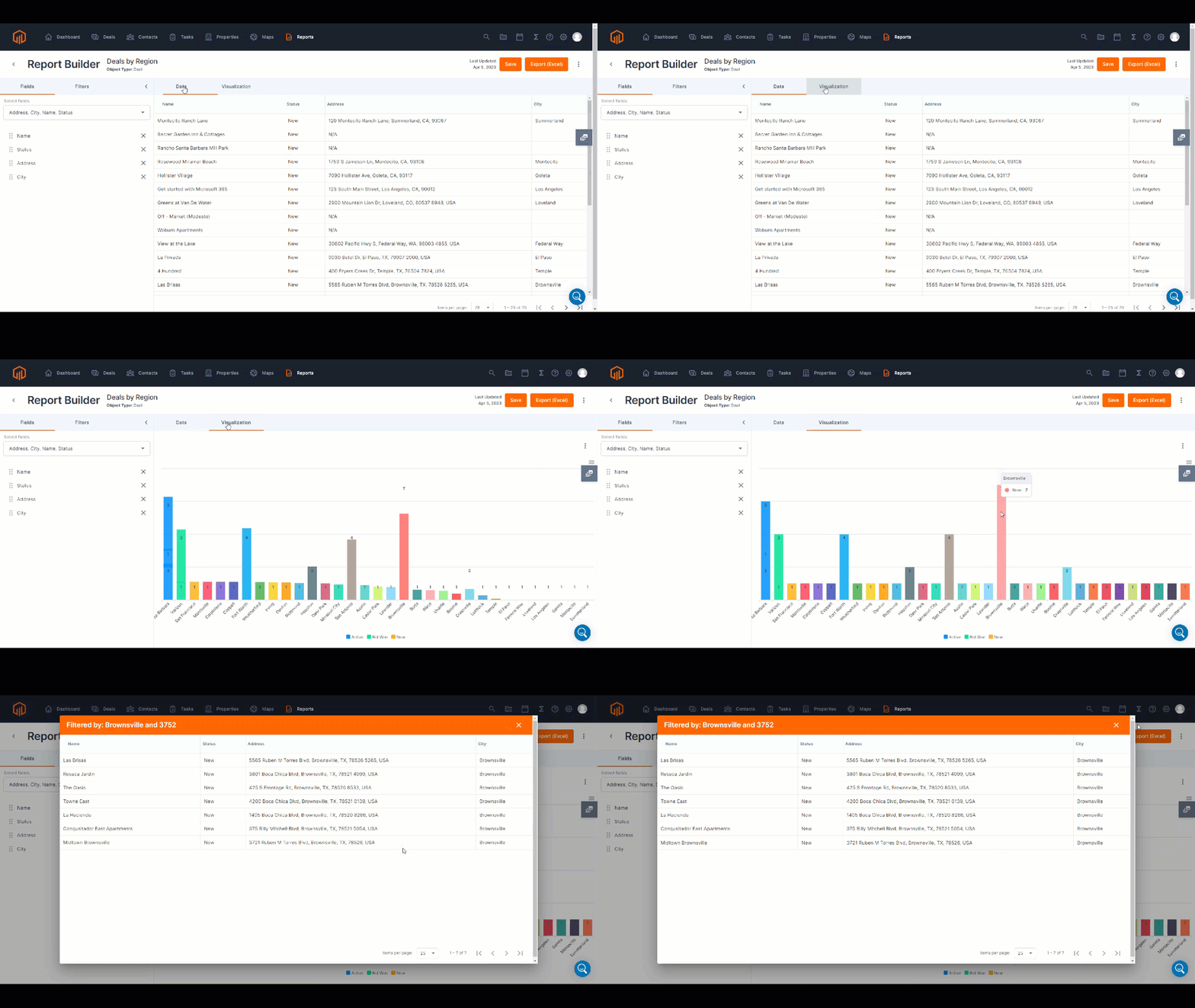
Visualize report data through charts and graphs.
Select a type of chart (Bar, Line, Horizontal Bar, or Donut) to actualize the data constructed from the custom report.
Drill down into details of the visualization data by clicking into the chart.
📑 Learn to:
💡 Things to Consider:
Visualizations created within Reports can be added to Dashboards. Visualizations are dynamic and any changes made will be reflected in the dashboards they are a part of.
Troubleshooting: Visualizations are cached and may need to be refreshed if you find that they have not updated after a change is made to the report or the deal data. 
⚙️ Steps
Add a Report Visualization
-
Select a report from the list to view report details.
-
Select the Visualization tab.
-
Follow the prompt in the center pane or select "+ Add Visualization"
-
Use the dropdown to select a chart type. Then define the parameters in subsequent fields.
-
Select Create to save the parameters. The chart will populate into the Visualization tab.
Edit or Remove a Report Visualization
-
Select a report from the list to view report details.
-
Navigate to the Visualization tab.
-
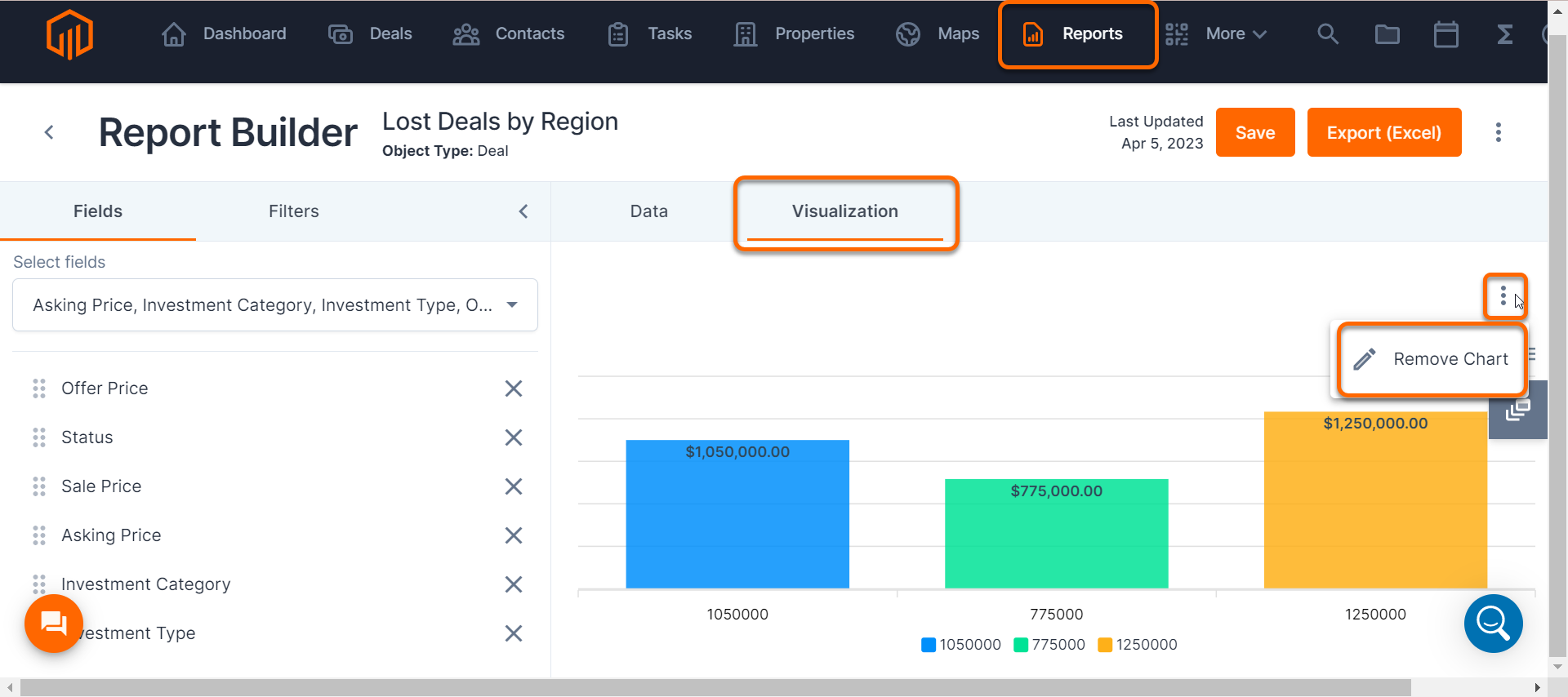
Select the ⁝ icon from the Visualization tab.
-
Select "Edit Chart" to make changes to the existing visualization or select "Remove Chart" to delete the visualization.
There is not a confirmation message when removing the report visualization. Visualizations that have been removed cannot be retrieved.


